Monday, 21 April 2014

questionaire-title squence feedback
Please fill out this after veiwing our film
https://docs.google.com/forms/d/1gI7R83-J-BIcFVVSsO1rWd-J-nEHGq-_FHZNnDeuzAM/viewform?usp=send_form
https://docs.google.com/forms/d/1gI7R83-J-BIcFVVSsO1rWd-J-nEHGq-_FHZNnDeuzAM/viewform?usp=send_form
Sunday, 20 April 2014
problems and issues we faced
After filming many of our scenes we found out that Daniel had broken his leg this means the next scenes with Daniel in wouldnt be possible to shoot in time as he couldnt walk. Lucklily in the shots that we had filmed previously shot a few were positioned in an angle perposly positoned to hide Daniels face to build suspense and mystery about the character, the shots with daniels face we had to reshoot. One of our group members joe was used to be our new killer.
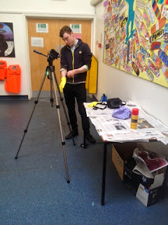
joe putting on glove prop
Another issue we faced as when i was creating the match on action the test for it using her neckless and a image of the moon worked fine:

I used this test image of the moon for the match on action.

I then had the clip of the moon on one layer and the clip of the neckless on another layer and over lapped the ending of moon clip with the opening of the shot of daisy' neckless.

I then used the pen tool to make a time marker on the opacity level.

Then with the mouse select i dipped the opacity level down and then created another marker and had it run at 20% and then slowly dip down to 0% as daisys neckless was fading through to create a smooth match on action.


Through testing this i was sure i could do it but when gathering the footage for a shot of an extreme close up of the moon the nights where realy cloudy and i was unable to film a full moon so we disided to have a zoom from the neckless instead which i later edited in with some music and worked really well.
process of our props


Another prop we disided to use where some rubber gloves to create a dangorous,hazardoss effect,to clearly show the prop he is handling is dangourous.
Saturday, 19 April 2014
Editing- Colour Correction
When editing our film i disided to apply some previous skills i had learned. I used the colour correction tool and the contrast/brightness levels to alter the apearence of our footage to create a more sinister looking lighting.

The tool used is video effect > colour balance > video effects
I also had to change the exposure as when i filmed this scene below the exposure was too high and created the clip to seem grainy but by turning the exposure down creates the scene to be more sharp than it previously was.

I then needed to apply the previous settings of the last frame to the next so it runs smoothly,this turned out well and i was pleased with the outcome and so was my group but gee suggested we should make it look more sinister and cold by adding a blue filter to the scene. I turned the blue highlights and midtones up by 5% and kept these settings throughout the scene with the other shots.

By applying these changes to out footage instead of keeping it raw alloud us to refrained from having high key lighting and over exposed footage that comes across as bright and creates the feeling of happiness but with the settings used contributed to our horror/thriller movie, Also from our groups research we could see how low key lightning is widely used in thrillers as this technique relies on one light source "it may cast light over one object whilst leaving others in darkness/shadows." Which we did with our opening scene with a lED light shining down on daisy.
Wednesday, 26 March 2014
Tuesday, 25 March 2014
Wednesday, 19 March 2014
Thursday, 13 March 2014
storyboard final
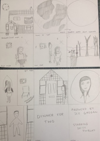
1) The establishing shot of the house (at night time/ evening) preferably evening so that the lighting is dim and eerie.
2) Zoom to the moon.
3) Graphic match to a pearl on the girl's necklace.
4) High angle shot of the girl sitting tied up in a basement in darkness. (night vision camera effect)
5) A man walks in, turning the light on (potentially grabbing her face)
6) A long distance shot, panning the woodland area catching the two walking along holding hands.
7) A split screen shot.
- left hand side; the girl getting ready in the mirror wearing a dressing gown.(high angle)
- right hand side; a man preparing the basement area with ropes/ chair. (low angle)
8) A shot of the girl walking along the house (panning) up to the front door.
9) A fish eye/ crab shot of the girl through the peep hole.
10) The man opening the door and welcoming her in.
11) DINNER FOR TWO
12) Credits.
Tuesday, 11 March 2014
characters
Characters

Daisy Embury:
This is our character we will use for the female character who is the victim in the opening. For the opening we will need to make daisy look ill in the opening as she is being locked in a small space which is dark and warm; for this we will make her look sweaty/ pale. By doing this we will use pale make up and make her look sticky by make her forehead wet. Moreover throughout the piece we want to make her look as average as we can (reflective of mise-en-scene in thriller research)- because the characters traditionally throughout are average and therefore more relatable we would want her to be dressed in plan, darker clothing with not much make up (bare minimum).

Dan Dodd:
Throughout the opening Dan's head will be cut off, yet when it comes to him preparing the room and sending the text we reveal the character still unaware to the audience if it is the same man or not. For Dan's character we will want him to play someone with very little emotion throughout as he will then appear more mysterious and therefore building tension for the audience. Dan will also be dressed in everyday clothes which will be dull and insignificant.


Wednesday, 5 March 2014
Storyboard research
The Process of Story Boarding
Storyboarding is a process that many film production companies utilise in order to organise scenes into seperate shots, allowing them to ponder ideas before actually shooting a scene. The process involves collating a number of different sketches and assembling them in a chronological fashion to form a full scene taking into account the lighting, camera, mise en scene and editing that is projected to be used in the scene whilst annotations are made to get ideas across clearly. Joe Ranft was a very famous storyboarder/voice acotr/screen writer who worked on every Pixar animation project from 1980-2005 before he tragically passed away. He would collect a plethora of sketches that eventually form the basis of the storyboard, before selecting which shots seem most viable and organising them accordingly. Storyboarding is an incredibly beneficial process financially, as it means actors on lucrative salaries are not being paid for more hours than they are actually required for as the scenes have been planned.
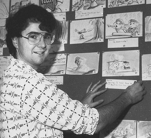
The photo above depicts Joe Ranft organising one of many storyboards for Disney Pixar.
Researching story boarding is certainly relevant to our project is it could save us time when filming, as we will have prepared an array of sketches that represent camera angles that we project to film, and will therefore allow us more time to edit/re-film certain scenes. We are going to devise a storyboard with annotations, that is meticulous and takes into account every camera angle/editing techniques we are going to use.
Storyboarding will benefit us greatly in our task, if we have a clear plan as to what we want to shoot, it will make filming more concise and therefore we have more time to edit. The storyboard can be a short sequence of pictures, or an intricate and comprehensive plan that includes almost every shot the director intends to use.
Storyboarding will benefit us greatly in our task, if we have a clear plan as to what we want to shoot, it will make filming more concise and therefore we have more time to edit. The storyboard can be a short sequence of pictures, or an intricate and comprehensive plan that includes almost every shot the director intends to use.
Thursday, 27 February 2014
costume
The female character is made to be a character who is sophisticated therefore the costume throughout will be used in order to represent this. Moreover we hope to create binary opposition through the characters dress therefore meaning the male character would be wearing typically "slobbish" or more casual clothing throughout our opening.
Within our opening the establishing extract is to be a shot of the house the girl is held hostage in, which zooms into the moon which will follow to a graphic match to the girl sitting on the chair in the basement's pearl necklace. Not only will this connote her wealth and sophistication this will also establish a story for the audience to work with, representing the significance of her wealth.


Within our opening the establishing extract is to be a shot of the house the girl is held hostage in, which zooms into the moon which will follow to a graphic match to the girl sitting on the chair in the basement's pearl necklace. Not only will this connote her wealth and sophistication this will also establish a story for the audience to work with, representing the significance of her wealth.


As the extract develops and we go to the scene where the girl is walking along with the boy in the common we see her in less sophistication yet still dressed up nicely. In a white long coat along with black jeans, back turtle neck and black boots.
These clothes will be in binary opposition to the costume of the male who, throughout will be wearing grey tracksuit bottoms and a grey sweatshirt. with some trainers. This will connote to the audience the different within the two characters from the start.
Monday, 24 February 2014
Sunday, 23 February 2014
Filming - day1
On the day filming i was unable to get the actors on the days i was free so i tryed out some possible shots to use of the house for the establishing shot.
below are some screen shots:


I then went on to add these into adobe after effects to add some darker filters on and you speed up the pan.
The out come of these looked quite good and i am thinking of using these in the final film after discusing it with my group.
below are some screen shots:
Some of the footage i disided to not use as the shot wasnt right or i was fully framing the house and it wasnt a good angle.
I then also realised that these shots looked to happy and bright and i needed to make them darker and more sinister looking.
I then went on to add these into adobe after effects to add some darker filters on and you speed up the pan.
The out come of these looked quite good and i am thinking of using these in the final film after discusing it with my group.
locations

The image above is the location where we will film in dog walking scene.
This is located just down the road from my house and will be easy to access and to film here is no issue as it is relatively quite and no houses.


Friday, 14 February 2014

Thursday, 13 February 2014

Wednesday, 22 January 2014
brainstorm continued

In the end we disided to move away from conspiacy thrillers and are doing a psychology thriller.
We are planning it on being about a man who liked a women and kid naps her after going on a date with her.
possiple titles/typography:


brainstorm

above are our idea for the genre of our film and a possible shot list of what we would like to use.
we have now updated it and will be including:
1)Dolly zoom-to show fear or shock.
2)Panning shots-To make our charcter to seem as if shes being followed/watched.
3)Reverse shot-signify a flash back,build up suspence.
4)crab shot-use a super wide angle lens(fisheye) on the door to create a peep hole effect.
We have then continued our genre brain storm on another peice of paper.
Friday, 17 January 2014
final editing task
below is our final edit:
Moreover it was a struggle to find a time when our characters would be able to come for filming as if they do not have the time to take out to help us/ act for us then it will push forward filming to another time. Moreover it is difficult with actors as we need to use the same actors the entire time, therefore if they are not able to act then we cannot film as it wouldn't work to just incorporate a new actress/ actor randomly. Therefore we need to make sure they are available well in advance.
As well as this we are filming in a darkroom at the start- but we didn't have night vision camera with us therefore we used the torch on our camera as a way to light up the room and shine on the girl's face- this actually worked really well as it ended up looking like something out of "quarantine". Quarantine is filmed entirely by a camera man therefore making it more believable for audience- almost like a real life documentary (true story).

We then decided on the idea that the girl would be being filmed by the man, therefore being a point of view shot from the camera. Therefore when we go to shoot the scene again, this is the idea we will try out and see if it works effectively.
Saturday, 4 January 2014
Thriller opening research - mise en scene
The strangers
In this clip we see a character who would be similar to the girl playing the role of the victim in our opening. From this we can see she is wearing average, plain, dull clothing along with bland make up, this is used to take the attention away from the girl is dressed and instead the attention on what is happening in the opening. Alternatively it could be used to show that she is an average girl- making it more relateable to the audience, making them feel as if it could be them in the position. The character at the start is loud and angry which is binary opposition to her apprehension at the ending.

From the setting we can take that it is a large and vacant house which would heighten the tension in the opening by making her looking isolated and more alone. The decoration of the house is very bland, with the plain white/grey walls and the lighting used is dim and eerie.
Within the opening there is a main focus which starts and concludes the opening. The TV playing white noise. This prop is used to heighten the tension to the audience as it is frantic noise. We could incorporate a prop like this in our opening as it is symbolism for her being anxious/ nervous which is what the girl in our opening will feel.
The strangers
There is only two characters in this opening which do not match the sound of the voice on the phone at the end this is used for the audience to be left in the dark on what has happened which will build up the tension as they are on the edge of their seat to see what is to follow for the rest of the film. Moreover the character who are in it are two average looking boys who are dressed in again bland clothing. This is interesting as throughout our brainstorming we imagined the male and females costumes to be significant of their characters- this is something we will need to look into.
Similarly with The Ring, in The Strangers we can see that the houses used are large and again very spacious. This could reflect upon the idea of the despondency and isolation of the character. Moreover when moving to house to house they use a slow motion effect on the shot which creates dramatic tension which is very effective in this opening- we could use this in our opening as our establishing shot is of the house. Yet the lighting used is light and calm which could represent the idea of "the calm before the storm".
The opening has some titles at the start which is spoken over. We are particularly interested in the title sequence itself- the significance of the colours used. The black background could be connoting the darkness and scariness of the story with the deep orange/ red writing on top used to represent danger. In our opening we plan to use a background with writing over it for our credits- therefore this is something we could take to influence the way ours will look.
The Women In Black
With this opening the characters used are young and innocent looking, although it is obviously set in an earlier time these children are representative of average looking children at their age at this time. Moreover their change in facial expressions from the start to end is binary opposition of them playing happily to them suddenly being overcome by something. This is similar to The Ring.
Moreover similarly to the other two openings, which appears to be a convention of horror thrillers is the open rooms in large looking houses. The lighting used in these houses appear to be dim and dreary, within no unnatural lighting throughout- this maybe to make the audience feel cold and reflect the dull atmosphere.
The props used in this is a stereotypical horror film prop- dolls these are used as they can be made to appear creepy.
Summary:
From looking at the mise- en- scene in thrillers I have learnt that the houses used are large, open and dimly lit. Therefore our group will need to find rooms which are plain, with not much colour and film at a time when it is not too bright (midday/ morning) therefore creating the cold atmosphere for the audience. As well as this we can learn that the characters in the openings appear to be wearing average, dull yet typical of the person clothing in order to not take away the attention of the storyline throughout. Therefore we may need to re- think our costume ideas. Finally throughout the openings there appears to be props used to enhance the tension of the opening which again is something we should consider when making our opening.
Friday, 3 January 2014
Thriller opening research - camera,sound & editing
Anatomy of a Murder
The opening of the film uses cartoonised body and uses close ups on different parts off it. This is not very graphic and its quite simplistic which gives the impression that the film isn't going to be extremely violent even though it is about murder. We get an impression that it could possibly be quite light hearted. Also using the body it makes it clear that the film is going to be about people being killed as we are shown all the body parts seperately. This clearly links in to the title. The font they use is a white sans-serif font. This makes it quite informal which links into the sense that the film could be lighthearted. Using white subverts our expectations. White connotes to innocence and purity which is not something that is at all related to murder. However, it is written on a black/grey background which relates more to murder as black can connotes to death and danger. The music used is quite upbeat which is contrapuntal. It yet again subverts our expectations of a film about murder, it is quite disturbing that the music is so happy when the film is going to be about people getting murdered.
Se7en
Grand Prix
For our thriller we intend to do some opening credits on a background. For this we will need to research the reoccurring themes for credits in a horror film opening sequence. Here is some research I did looking at clips to see the type of typography they use.
From this we can see that we need to make sure the writing that we put on the screen is in time to sound we choose to use. We can see that the reoccurring theme in horror thrillers openings block and capitalised font which isn't over complicated by being on a straight black background, or something that reflects the storyline.
Subscribe to:
Comments (Atom)